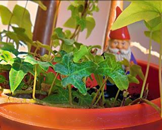
Before
After
- We both put the emphasis on the plants rather than the gnome in the plant pic
- We both emphasized the contrast of the color of the living flower vs the dead flower
- We both focused the emphasis on the water rather than the sky
- I muted the color of the gnome so it stayed in the background
- I darkened the highlights on the plants so there wasn't a glare
- I blurred the background to emphasize the leaves
- I like that McKenzie kept the lake photo in color
- the photo seems more dramatic
- I liked that I made the living flowers more vibrant
- it creates a more dramatic contrast between the living flower and the dead flower
- McKenzie likes more muted and soft photos
- there seems to be more tension in her muted photos


-Courtney and I both like soft edits of subjects, colors are still vibrant, and the contrasts are still deep
ReplyDelete- Courtney likes to really emphasize color, unfocused and lighten the picture, and a brighten the photo
- I really liked the flower picture and how she kept the foreground flower matte-like and the background flower extremely bright and pink. The bright pink flower draws the viewer's attention to the photo.
- What I did better was the gnome picture and how it looks like a painting in some way. I liked the darker colors instead of the brighter ones.
- They like bright and colorful pieces when it comes to specific objects and black and white when it comes to simple landscapes.